ATCA Case File — Intelligence Brief
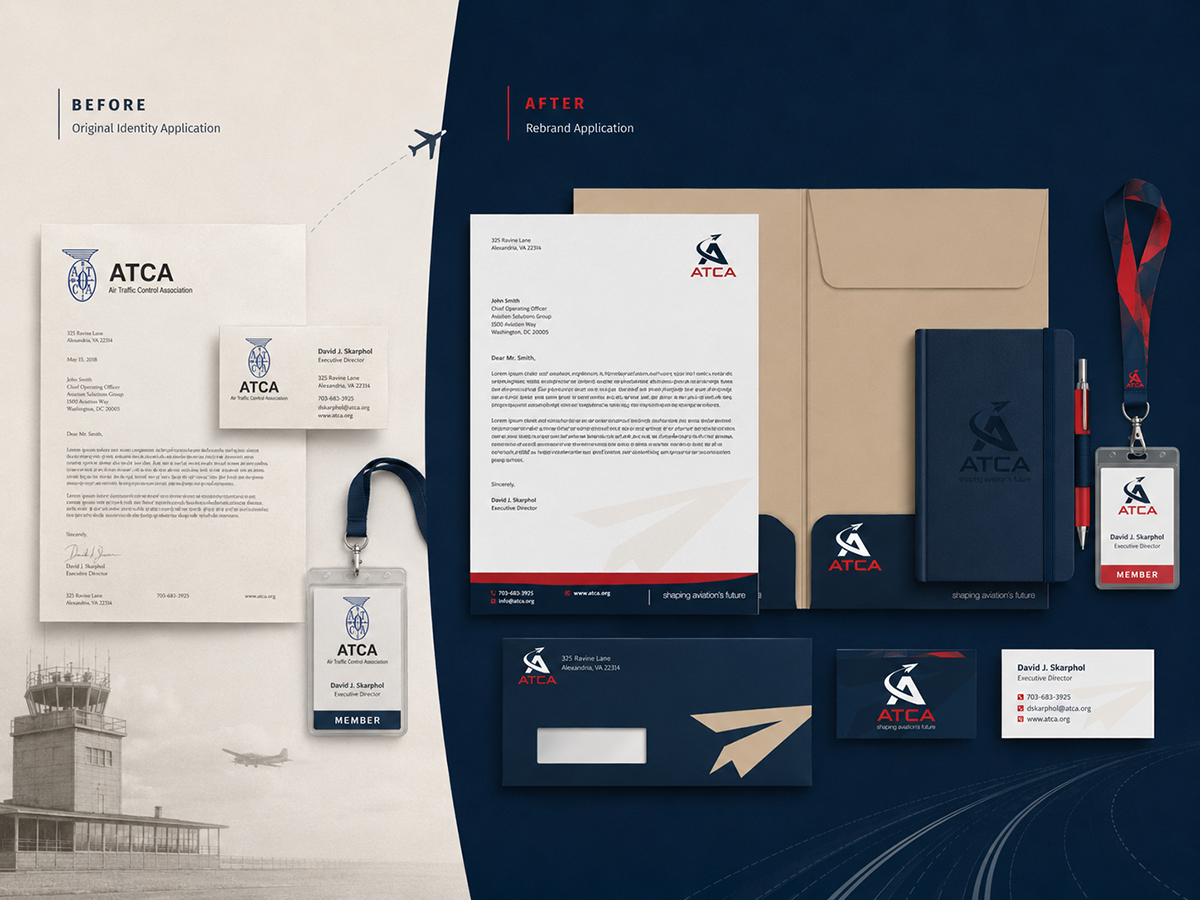
Engagement Debrief · 2024–2026
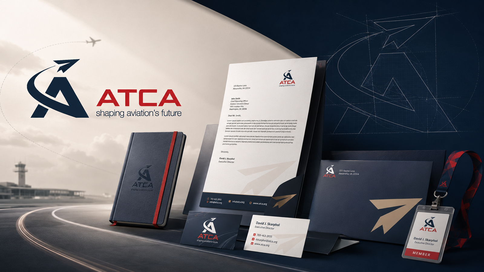
70 Years.
A New Direction.

The Air Traffic Control Association had carried the same logo for nearly seven decades. Westover Creative was tasked with giving one of aviation’s most respected organizations a visual identity worthy of its next era.

Engagement Length
2 Years
Events Designed
7+ Events
Social Platforms
4 Platforms
Templates Built
10+ Templates
The Situation

A Legacy Mark
Past Its Prime

The ATCA had operated under the same logo for nearly 70 years. While ATCA had grown into a globally respected voice on aviation safety, policy, and technology, its visual identity hadn’t kept pace. The original compass-and-wings emblem felt institutional and dated — disconnected from the forward-looking mission the organization had built.

Leadership recognized the moment: a complete visual overhaul was needed, not just to modernize the mark, but to signal a new chapter to members, partners, and the broader aviation community.

Logo Design Brand Identity Stationery System Event Design Social Media Capability Statements Trade Show Displays Templates
ATCA before and after brand identity comparison
Original identity application vs. rebrand application across stationery, credentials, and collateral.
The Engagement

Built to
Fly Further

Westover Creative designed a new mark built around forward motion: a bold A-frame structure with a paper plane launching from its apex, unified by a sweeping arc that conveys aviation precision and organizational ambition. Navy and red — ATCA’s established colors — were refined into a crisper, more contemporary palette under the tagline Shaping Aviation’s Future.

What began as a logo project expanded into a full brand identity system: business cards, letterhead, envelopes, member credentials, lanyards, notebooks, trade show displays, event programs, award collateral, and a complete social media template library. ATCA moved to an Task Force subscription subscription, keeping Westover embedded for three years of continuous work.

ATCA logo construction geometry and design framework
Logo geometry and construction framework — every element engineered with precision.

Before & After

70-Year Mark
New Identity

← Drag to Reveal New Identity →

What started as a request for a fresh logo turned into a years-long relationship. We quickly became Task Force subscribers and were always thrilled with the attention to detail.
Bridget D.
Director of Marketing · ATCA
The Outcome

Cleared for Takeoff

The rebrand launched to enthusiastic reception from ATCA’s membership, industry partners, and the broader aviation community — celebrated as a bold but respectful evolution that honored the organization’s legacy while signaling genuine momentum forward. What began as a single logo project became a three-year embedded creative partnership across events, social platforms, print, and marketing touchpoints.

2
Years of embedded
creative partnership
7+
Signature events
designed end-to-end
Global
Rebrand launch across
all member touchpoints
← Back to
All Case Studies
Next Debrief →
Asc3nd

Ready to
Deploy?

Every engagement starts with a fit call. We’ll assess your creative situation, recommend the right mission type, and move fast.